/ arkisto colours
colours palette
・ client projects ・


Brand colour palette design for Arkisto
Arkisto, meaning « archive » in Finnish, is a Korean lifestyle brand that proposes both Finnish vintage design pieces and original products, inspired by the Nordic beauty and Korean craft.
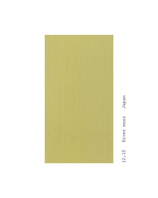
This palette is made of colours that come from my personal colour diary. Issued from various memories in Finland and Japan, I composed this series as a blend between the Nordic’s clear hues and the deeper hues of the oriental culture.
Arkistoのブランドカラーデザイン
Arkisto(アルキスト)は、フィンランド語で「アーカイブ」。北欧の美しさと韓国のクラフトを合わさった、フィンランドのヴィンテージデザインとオリジナルプロダクトを提案する韓国のライフスタイルブランド。
このカラーパレットは、私個人のカラー日記から来ている。
フィンランドと日本での様々な記憶をもとに、北欧の澄んだ色合いと、東洋文化の持つ深みのある色彩を融合させた構成としてデザインされたもの。
2024
Arkisto (South Korea)
Symbol design
Graphic design by Joosung Kang
South Korea
Colours: Elisa Defossez
Photos: Arkisto